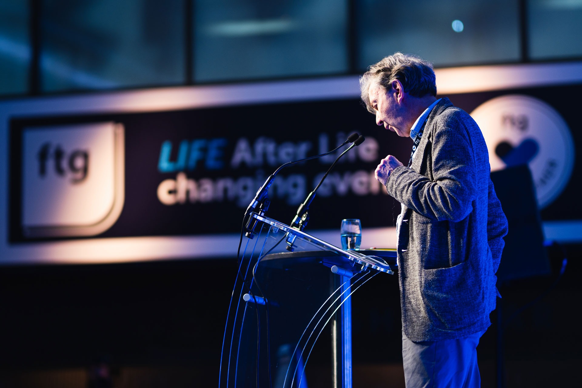
Frenkel Topping: Realigning a Market Leader
The Challenge
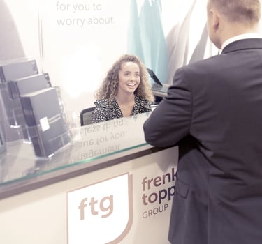
Frenkel Topping Group is a market-leading, multi-disciplinary firm in the legal and financial services sector.
Their rapid growth, however, meant their existing brand had become fragmented across multiple divisions. Their external visual identity no longer matched their true authority or their unified, high-level expertise. They needed to move from looking like a collection of separate firms to looking like one confident, cohesive market leader.
The Approach
This project was a strategic partnership to Refresh their image and Realign their brand with their true position of authority.
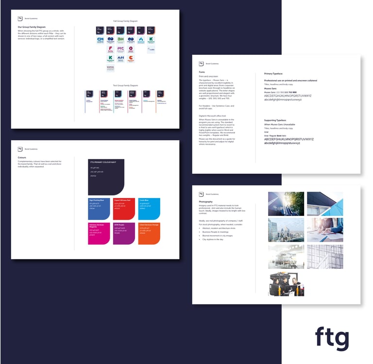
Strategic Alignment:
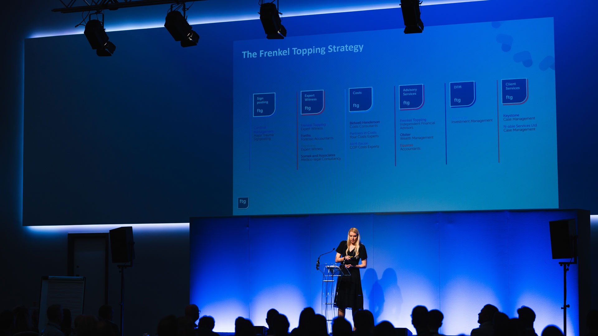
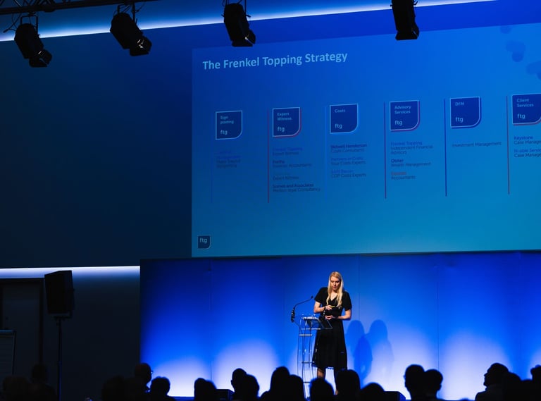
First, we worked with their leadership to untangle and simplify their brand architecture. This created a clear, unified system for the main "Group" brand and its various sub-divisions.
Visual Execution
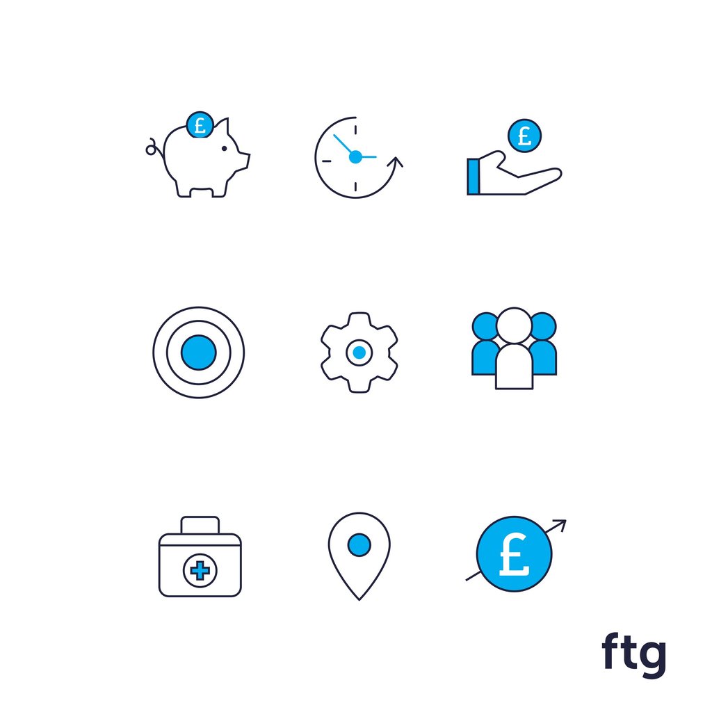
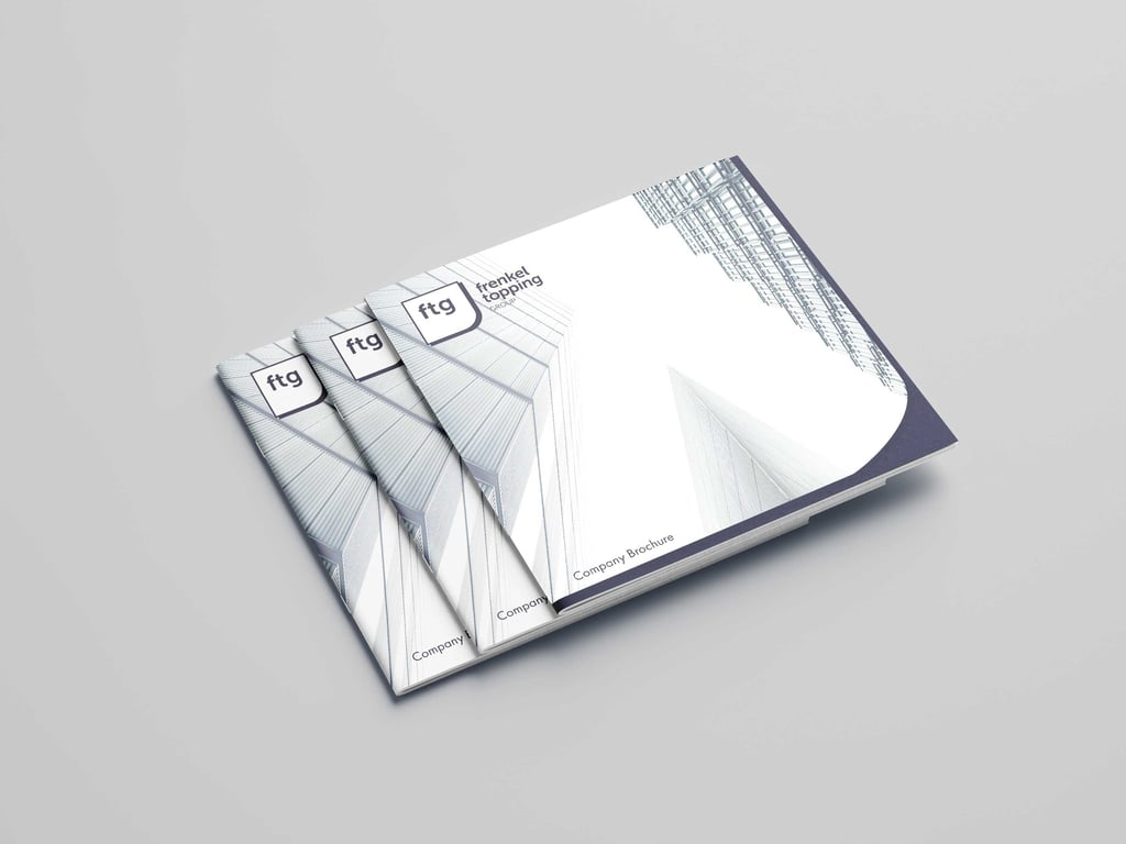
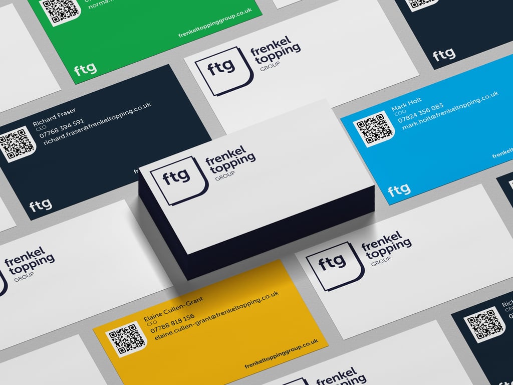
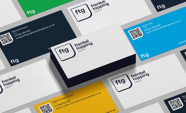
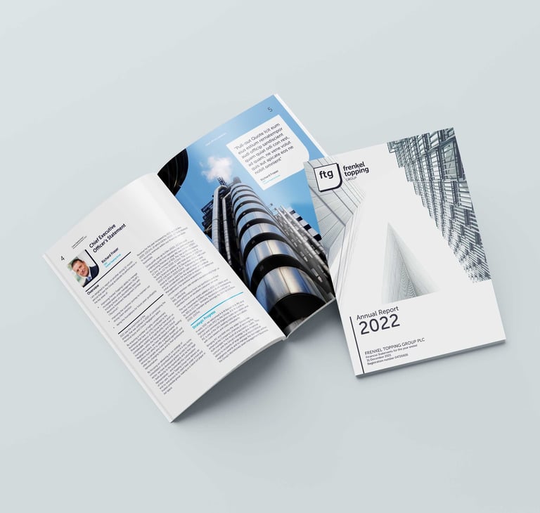
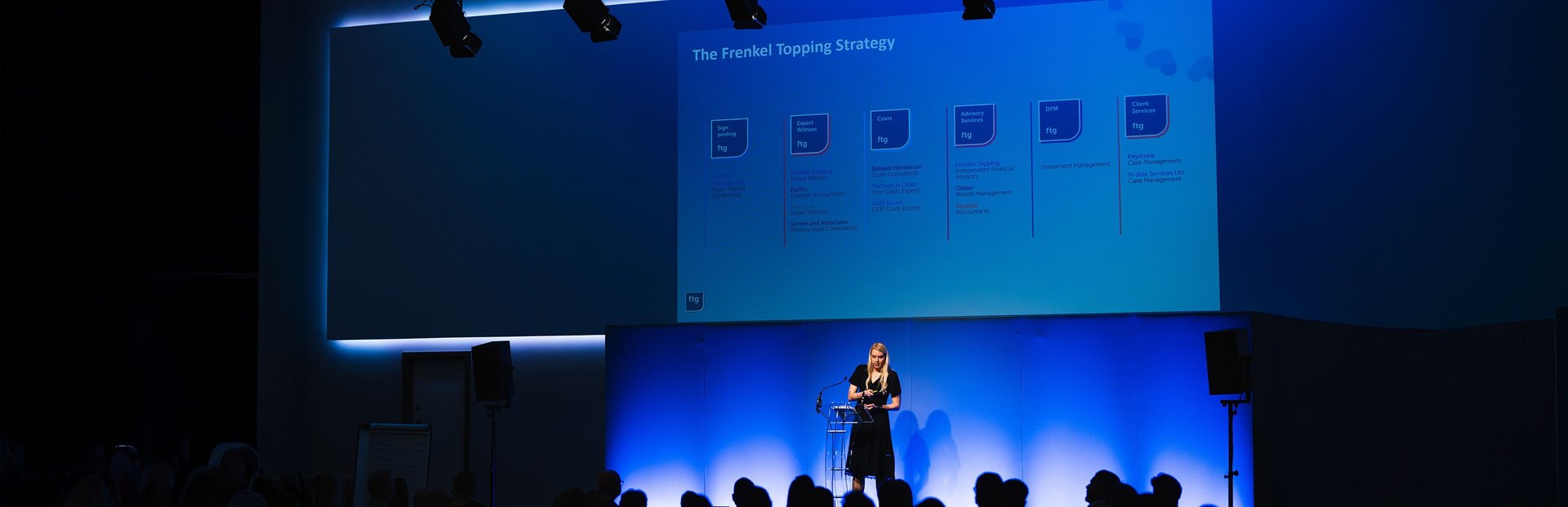
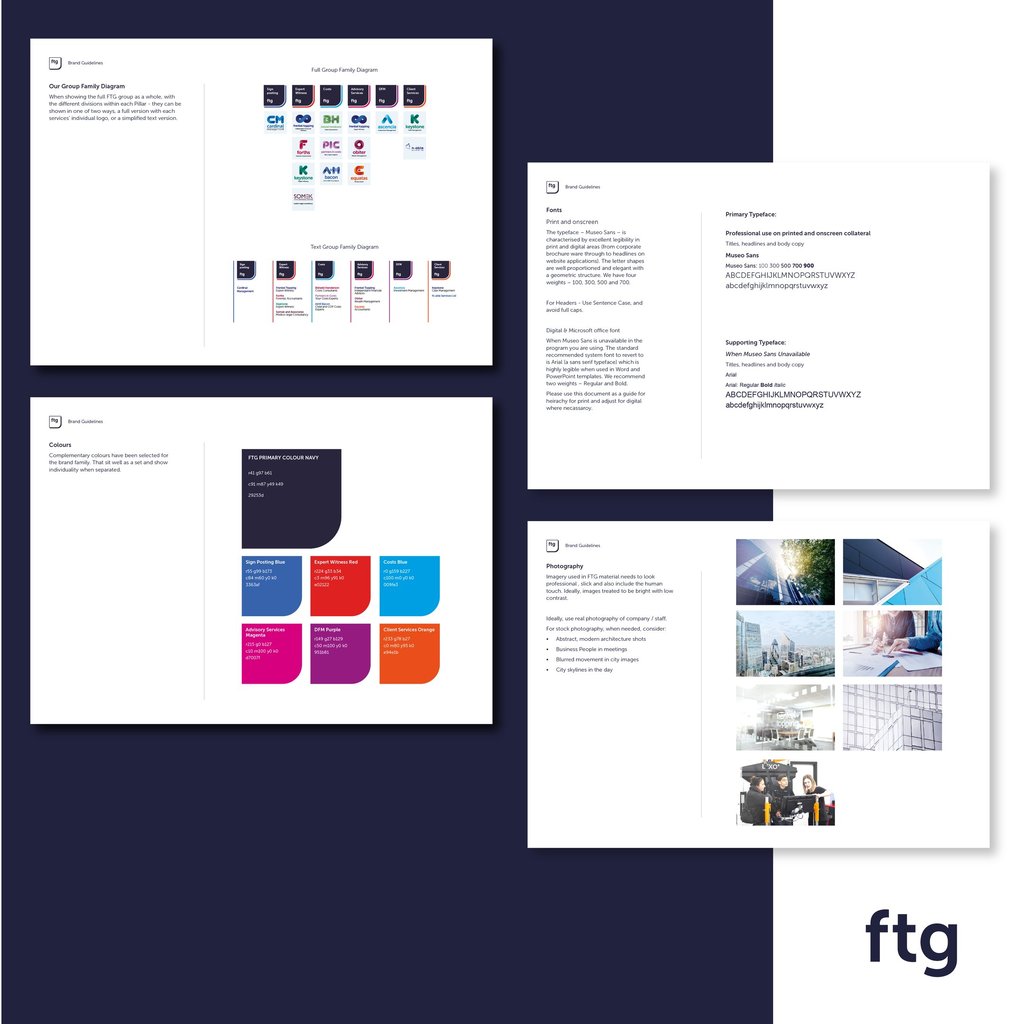
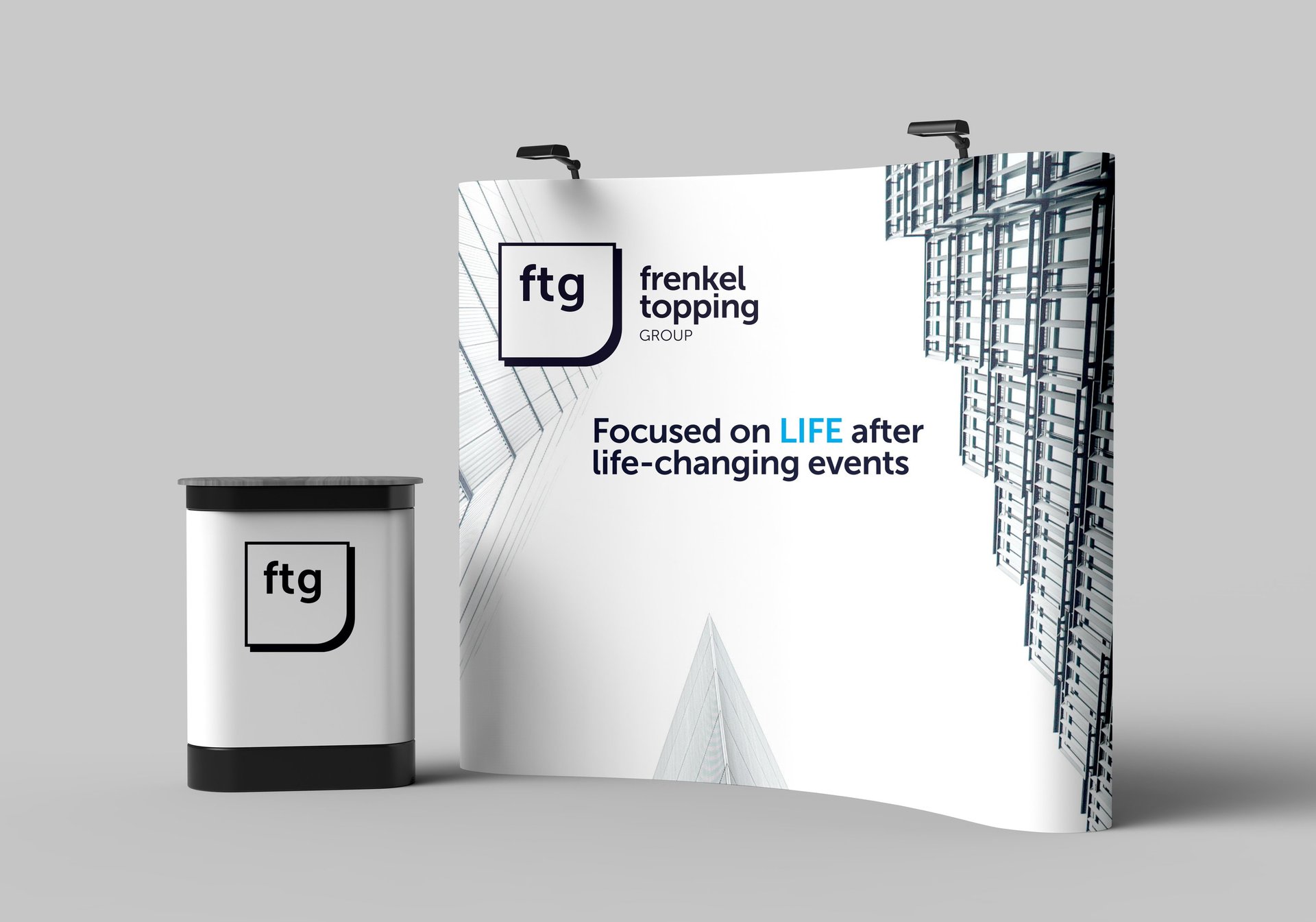
We then developed a refined and professional visual identity. This included new typography, a modernised colour palette, and a robust set of templates for their most critical materials - from corporate reports to their high-stakes pitch decks.
The Result
The new, unified brand identity has empowered Frenkel Topping Group to communicate with absolute clarity and confidence.
We delivered a professional, easy-to-use toolkit that consolidated their authority. This ensures that every part of their business - from leadership to sales - can now present a polished, premium, and consistent brand to clients, partners, and investors.